Roll the Bones Visual Brand Identity
Client: Roll the Bones
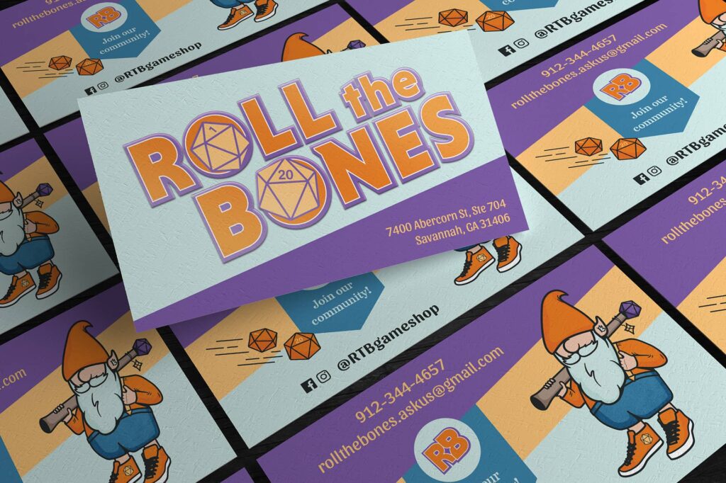
Goals
 Develop a visual brand identity system that’s clean, mystical, and unique
Incorporate D20s (20-sided die) into the logo
Design business cards that reflect the brand’s personality
Solution:
A bright and bold color palette is applied to a responsive logo suite that is playful but mature–perfect for the adult gaming community. Plus, a set of mascots bursting with personality, theme-appropriate graphic elements, and brand fonts that tie it all together.
Benefits:
Roll the Bones has the visual elements needed to start making all their visions come to life. They have a brand identity that can connect with gamers of all ages and skill levels, and mascots to add a bit of fun wherever they’re needed.


