Two Tides Crispi Brand Pattern Design
Client: Crispi by Two Tides
“Megan was extremely professional and easy to work with. Her project process is unmatched in the industry. From the very beginning Megan laid out all expectations, pricing structures, the project timeline, and more so both she and I could easily work towards the goal of creating our brand pattern as seamlessly as possible. Her method of delivering proofs is also handled in the most organized manner out of any other creative I’ve worked with. Because of the awesome structure she’s developed for her business, we were able to create something together we were both happy with before the projected project end date. She was able to pick-up on how I wanted the project to look from just a brief in person conversation where we discussed inspiration, colors, and the overall concept. Because of this, after the initial proof she sent me any of the changes I requested were very minor and quick adjustments. The work she did for Two Tides Cripsi will have a direct and positive impact on the success of my business and I’m very grateful.”
– Liz Massey
Two Tides Brewing
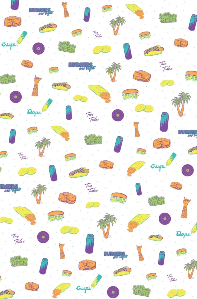
Goals
 A multi-purpose brand pattern that helps define Crispi’s brand
Miami Vice meets retro food truck vibes
One-color and full-color versions of the pattern
Solution:
A bright, bold color palette paired with an icon-based brand pattern that fits within Two Tides brand aesthetic, but stands on its own as uniquely Crispi.
Benefits:
The icons can also be used as stand-alone branding elements. With this one pattern, Crispi now has a whole suite of design assets that can be turned into merch, used in social media graphics, and more!


